I like it, but the anatomy is a bit off, the hips start at the bottom of the sides of the rib-cage, and her neck is a little long, but otherwise great job
http://img00.deviantart.net/1506/i/2015/340/2/c/female_body_study_by_tigrobobr-d9j7oyk.jpg
10 Art Reviews w/ Response
All 19 Reviews
BadTyke responds:
Hey man thanks for the critique! I'll keep that in mind :)
Pretty good sculpting work, I think you should look more into anatomy though. The pectorals are only made of three horizontal sections, and the top two abs almost look squished by the pectorals, they don't really compete with them for space. I like that you wanted to include the external obliques and serratus anterior, but you forgot the latissimus dorsi, which goes behind the serratus anterior and connect to the back of the deltoids. Also, look up the pattern of the serratus anterior and oblique muscles, it's a little complicated, but once you get it down, it makes muscular characters look much more defined, and a lot cooler in my opinion. Like I said, Great work
deafguitarist063 responds:
Ah yes that is true. I'm still learning to make accurate anatomy. Thanks for letting me know what i should work on. That clear my mind and push me to improve more on that area.
Thanks for the feedback :)
I like the color palette, think about using colors other than just black for the line-work like a red-ish brown or some other color that fits into this spectrum, so that it compliments your already great colors. but otherwise, pretty simplistic, but very appealing.
Bbycheese responds:
thank you for the advice!
This would be pretty good if you changed around a few small things. You mostly only see rain when there is something bright highlights it, and snow when something dark is behind it, whatever these specks are they're very thin, long and blurry, so I can only assume it's rain, either way, by covering the entire piece in this rain effect, it looks really blurry. if you had a stronger point of light, you could add more details to the branches of the trees (thereby creating bright spots in the painting for you to show the rain). I also think it would look better if the ground was more varied; right now the ground is just a gradient, and the trees aren't really creating cast shadows on it. But if you made the sides of the road dirt or something, you would not only make it look more realistic, you'd also draw the viewer's attention to the center of the painting, at the end of the road (which could look very cool). Like I said, the changes would be very small, but it would really finalize an already good piece
Everratic responds:
This is a great review! I'll keep these points in mind when I make my next piece. I'll probably make a similar painting so I can try implementing your suggestions. Thank you.
really good, i like the comic style mixed with your own cartoon style, good use of coloring and shading, which is easy see in the forehead. I also like the texture of the hair. VERY COOL
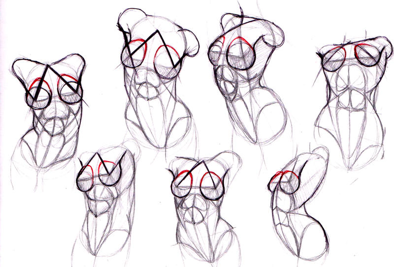
btw i love the aviators
Angry-Hatter responds:
Thanks for the nice comment! Glad you like it!
I make art
Age 25, Male
Seattle
Joined on 8/1/14


- Level:
- 4
- Exp Points:
- 159 / 180
- Exp Rank:
- > 100,000
- Vote Power:
- 3.95 votes
- Rank:
- Civilian
- Global Rank:
- > 100,000
- Blams:
- 0
- Saves:
- 18
- B/P Bonus:
- 0%
- Whistle:
- Normal
- Medals:
- 24